When logging in or entering Aimbase, the most common entry point is either the lead dashboard or the satisfaction dashboard. The screenshot below is an example of the LEAD DASHBOARD. On the lead dashboard you will see some high-level metrics that allow users to monitor lead volumes, year-over-year trends, dealer interactions, and percentage break downs of where leads are coming from.
At the top-right of this page, you’ll find a filter. If your install is set up to hold data for multiple brands, this filter will allow you to select one or more brands so the data reflects this filter. Without using this filter, the dashboard will default to showing all data within the platform that your user has permission to access.
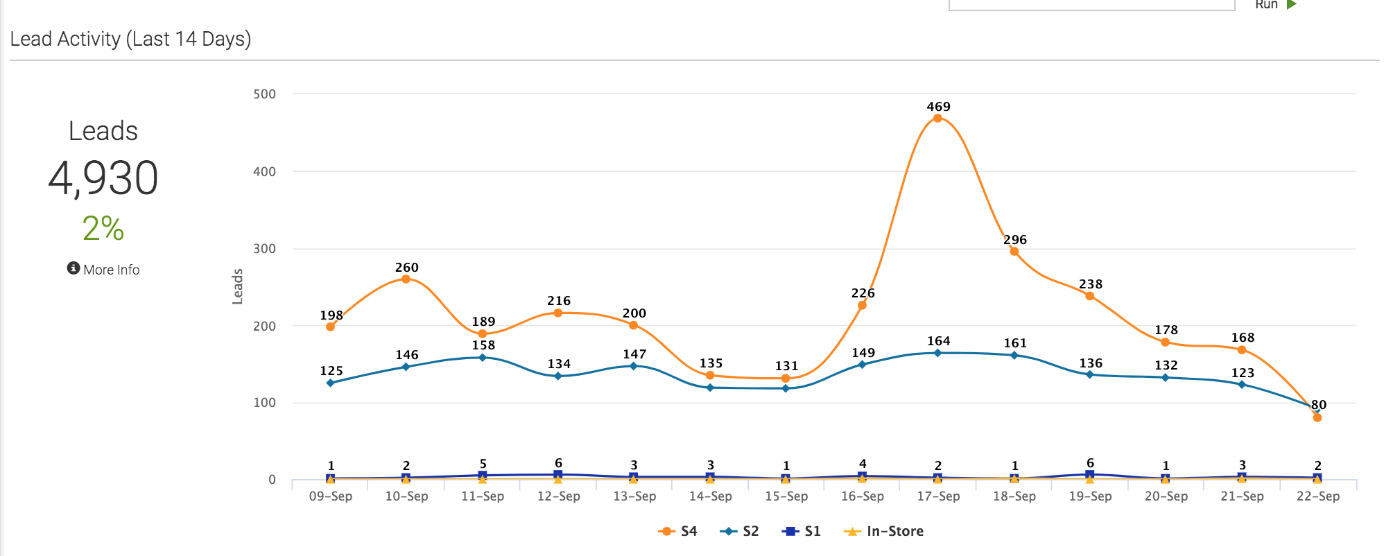
Lead Activity (Last 14 Days)
This graph shows you lead activity data points within a 14-day period. The key below the graph displays all Lead Categories that have has recent leads associated to them. When you see more than one Lead Category below your graph, you can toggle them on/off by clicking on the color key beside the text label:
The metrics on the left of the graph illustrate the total number of leads within the 14-day period.
The percentage below the number represents the percentage-change from the prior 14-day period.
Hovering over the ‘More Info’ section will display a tool tip that will articulate more information about the data being displayed.
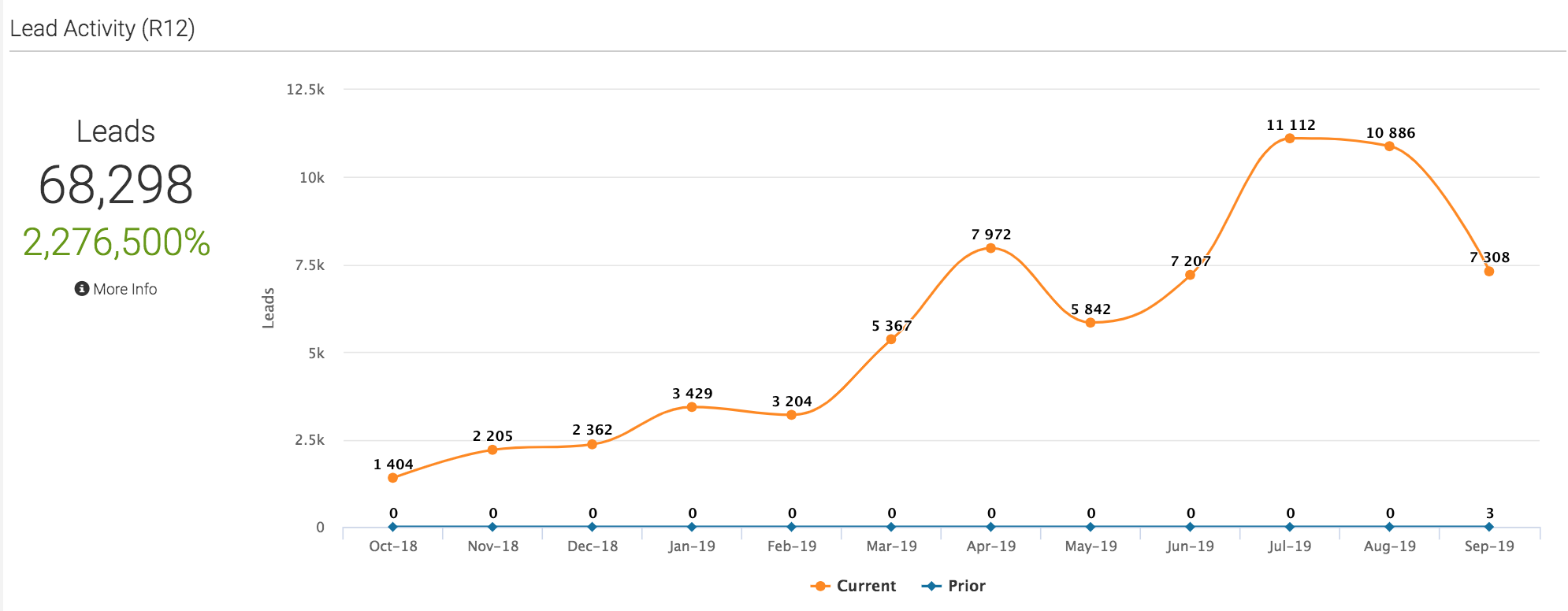
Lead Activity (R12)
The following graph also shows lead volumes. However, instead of a 14-day interval, it displays a rolling-12 (12 months from the month you are in currently) metric with a year-over-year comparison. The key below the graph displays the color code for the current and prior time period. By clicking on the colored portion of the key, you can turn each on/off.
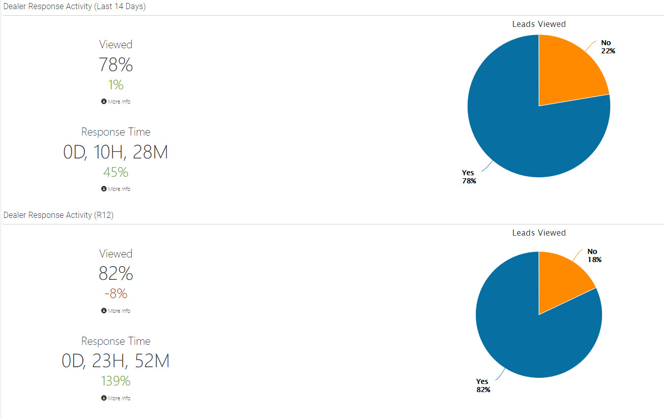
Dealer Response Activity (Last 14 Days) & (R12)
This row on the dashboard supplies multiple metrics. The data is reflective of frequency that a dealer views a lead and the time it takes him/her to do so. The first set of these metrics is based on a 14-day period. The second set are the same metrics, but this time they are reflective of a rolling 12-month period.
The first metric (Viewed) shows the percentage of leads that have been viewed by the assigned contact at the assigned dealer. Below that is a smaller, colored metric displaying the change in this percentage from the prior time period. These metrics are also reflected in the pie graph to the right.
Below the ‘Viewed’ metrics are additional metrics reflecting the average Response Time. This number is based on the average time it takes a dealer to either a)click the ‘View Lead’ link in the email notification he/she receives, or b)log into Aimbase and view the lead from there. For the latter to work, the email address you login with must be the same email address the notification email is sent to. Below the average ‘Response Time’ metric is a percentage which reflects the change in this metric from the prior time period.
Types, Categories & Sources (Last 14 Days) & (R12)
On the pie charts displayed within the Types, Categories & Sources rows, you’ll find three different sets of metrics. There is one pie chart for each metric: Lead Type, Lead Category and Lead Source. Each chart displays the breakdown of how leads from either the last 14 days or the last 12 months are categorized. By clicking the colored dots below each pie chart, you can remove any combination of Types, Categories and Sources from the calculation.
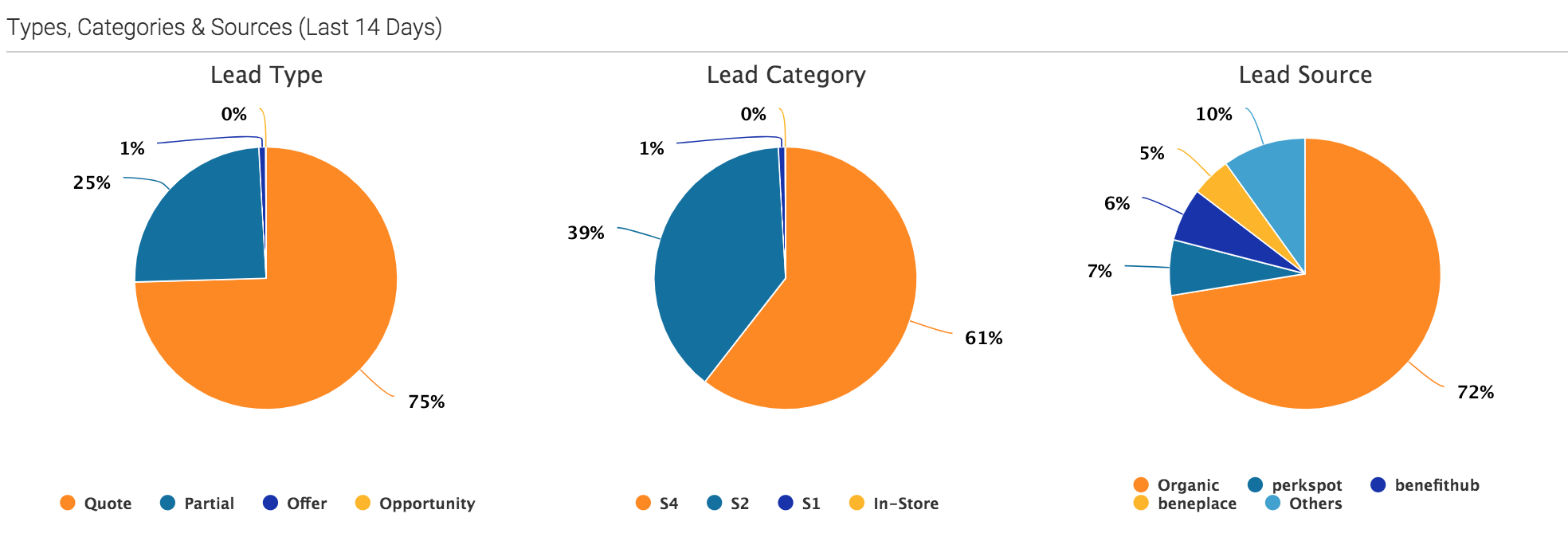
For more information about the terms used to categorize leads, please view the Glossary section.
Frequently Asked Questions
1. What is the Lead Dashboard in Aimbase?
The Lead Dashboard is one of the most common entry points into Aimbase. It provides high‑level metrics such as lead volume, year‑over‑year trends, dealer interactions, and breakdowns of where leads originate.
2. How does the brand filter work?
If your Aimbase setup includes multiple brands, the filter in the top‑right corner allows you to select one or more brands. All dashboard data will then reflect only the selected brands. If no filter is applied, the dashboard defaults to showing all data your user has permission to access.
3. What does the “Lead Activity (Last 14 Days)” graph show?
This graph displays lead activity over a 14‑day period.
- The metrics to the left show the total number of leads for that timeframe.
- The percentage beneath reflects the change compared to the previous 14‑day period.
- The legend shows all Lead Categories with recent activity, and you can toggle categories on or off by clicking the colored keys.
- Hovering over More Info reveals additional details through a tooltip.

4. How is “Lead Activity (R12)” different?
Lead Activity (R12) presents rolling 12‑month lead volume data, including year‑over‑year comparisons. The legend allows you to toggle between current and prior time‑period metrics for easier analysis.

5. What do the Dealer Response Activity metrics represent?
This section displays how frequently dealers view leads and how quickly they respond. Two sets of metrics are provided:
- Last 14 Days
- R12 (Rolling 12 Months)
The Viewed percentage shows how many leads were opened by the assigned dealer contact. The small colored metric beneath it shows the change from the previous period.
The Response Time metric reflects the average time it takes the dealer to view a lead via the email link or by logging directly into Aimbase. (The dealer must log in with the same email address that receives the notification.)

6. What are “Types, Categories & Sources”?
This section includes pie charts for Lead Type, Lead Category, and Lead Source for either the last 14 days or the rolling 12‑month period.
You can click the colored dots beneath each chart to add or remove items from the calculations, allowing for customized metric views.
